what:
exhibition architecture
who:
Museum of Modern Art, Warsaw
when:
2025
artists:
Luis Camnitzer, Jarosław Fliciński, Tobias Putrih, Kateřina Šedá, Slavs and Tatars, Rirkrit Tiravanija – but most importantly children from primary schools from the towns located around Warsaw
curators:
Sebastian Cichocki, Helena Czernecka, Marta Przybył
production coordinator:
Agnieszka Błaszczyńska
builders:
MSN team
Primary Forms is a cyclic program carried out by the MSN and EFC Foundation for the primary school pupils. Each year selected artists prepare a set of artistic instructions as a basis for creating works of art by children at their schools. This year one of the main themes was art itself: what is art and what isn’t? So we decided to play along by making a bold statement: BLUE = NOT ART. And the rest – the artists’ and children’s work – is ART. Sneaky, isn’t it?
what:
visual identity
who:
Goethe-Institut
when:
2022
Visual identity of the series of events circulating around the Queer as German Folk exhibition presented at Goethe-Institut in Warsaw. Film screenings, debates and talks were bound together by the title unsere queere geschichte / nasza queerowa historia (our queer history).
what:
visual identity
who:
Goethe-Institut
when:
2021
Visual identity of the series of events circling around Joseph Beuys’ art and life. One of the elements of the identity is a new font, designed especially for this occasion. The letter ‘B’ has become the logo of the whole project.
what:
exhibition architecture
graphic design
who:
Adam Mickiewicz Institute
when:
2021
illustrators taking part in the exhibition:
Edgar Bąk, Katarzyna Bogucka, Zosia Dzierżawska, Katrin Ehrlich, Gosia Herba, Rita Kaczmarska, Kadi Kurema, Regina Lukk-Toompere, Paweł Mildner, Viive Noor, Priit Pärn, Anne Pikkov, Marja-Liisa Plats, Dawid Ryski, Urmas Viik, Katarzyna Walentynowicz
curator:
Magdalena Kłos-Podsiadło / Wytwórnia
project concept / coordinator:
Dorota Szczepanek / AMI
coordinator in Estonia:
Sławomira Borowska-Peterson / Polish Embassy in Tallinn
carpenters:
S4P / Manufaktura mebli
The exhibition of illustrations inspired by Stanisław Lem’s – the true visionary, philosopher and writer – Mortal Engines, published for the first time in Estonia. The works of a group of distinguished contemporary illustrators are shown in a surprising way. The constellation of wooden crystals holds a bunch of keys to visual mysteries. Fragments, bits and understatements are lurking in the aura of mathematical oddity…
The exhibition was shown at the Children’s Literature Center in Tallinn, and it will soon go on tour in Estonia and Scandinavia.
what:
exhibition architecture
who:
Zachęta – National Gallery of Art, Warsaw
when:
2020
artists and their children taking part in the exhibition:
Olaf Brzeski with Konstanty, Iza Chlewińska with Miłosz, Kinga Nowak and Tytus, Zbigniew Rogalski with Tymon, Jaśmina Wójcik with Zoja and Lea, Paweł Althamer and Kosma, Monika Drożyńska with Tymon, Malwina Konopacka with Aniela, Teresa and Julia, Cecylia Malik with Urszula
curators:
Zofia Dubowska, Karolina Iwańczyk, Katarzyna Kołodziej-Podsiadło, Anna Zdzieborska
producer:
Anna Muszyńska
builders / carpenters:
Marcin Sokołowski + the team
Andrzej Bialik
The exhibition was designed for children and their parents/care-takers. It comprised a series of interactive installations prepared by the invited artists and their children. How can you spend time with your children – creatively, and what’s equally important – un-digitally? With a piece of string, a stick, or a crayon… The exhibition’s purpose was to inspire parents and children to play and create together, as a team.
what:
posters
who:
Wrocław Opera
when:
2019
We had a chance – and a great pleasure – to design posters for the two opera pieces shown at the Wrocław Opera House, Gounod’s Faust directed by Beata Redo Dobber and Verdi’s Traviata directed by Grażyna Szapołowska.
what:
visual identity /
exhibition architecture
who:
Regional Museum in Stalowa Wola /
Gdynia Design Center / Gdynia City Museum
when:
2016-2017
curator:
Agnieszka Jacobson-Cielecka
The Roundabout Baltic exhibition is more like a narrative – it tells a story of connections and similarities in thinking about design among artists living and working around the Baltic Sea. The curator had chosen 70 objects, which form a surprisingly coherent collection.
We designed an easy to assemble display system, exhibition’s visual identity and the whole set of publications, including a book written by the curator. Everything in the Baltic steel-and-kelp shades…
The exhibition was presented in all Baltic countries and also on Iceland.
what:
visual identity /
exhibition architecture
who:
Adam Mickiewicz Institute /
Regional Museum in Stalowa Wola
when:
2018
curator:
Agnieszka Jacobson-Cielecka
carpenters:
S4P Manufaktura Mebli / www.studio4projekty.pl
photography (catalogue):
Anna Orłowska / www.orlowskalipinski.com
What is the colour spectrum of Hungarian, Czech, Slovak and Polish designers? Is colour completely globalized, or can you find regional traits and preferences? The curator chose a few dozen objects, which form a subjective constellation – with colour as the main methodological force behind it.
Our task was to design the visual identity of the exhibition, printed matter and an easy to assemble, foldable, modular display system.
The exhibition was already shown during the Budapest Design Week 2018 and designblok 2018 in Prague.
what:
visual identity
who:
Ilona Trybuła /
Ciało Się Foundation
when:
2016
For quite a few years now Ilona Trybuła, the Warsaw-based dancer and choreographer, has been organising festivals, meetings and workshops focusing on improvisation in contemporary dance.
(sic!) was a series of improvised music and dance events at the Ujazdowski Castle – Centre for Contemporary Art.
what:
layout design, graphics, typography
who:
Joanna Szymajda /
Institute of Music and Dance /
Adam Mickiewicz Institute
when:
2017
Polish Dance Avant-garde Artists. Stories and Reconstructions comprises a collection of essays about Polish and Polish-born women artists who greatly influenced the development of modernist dance currents in Poland and abroad: Tacjanna Wysocka, Irena Prusicka, Janina Mieczyńska, Bronisława Niżyńska, Marie Rambert, Pola Nirenska and Yanka Rudzka. The texts were written by the researchers representing different generations and nationalities – invited by Joanna Szymajda to take part in this project.
what:
photography exhibition graphics
who:
Adam Mickiewicz Institute /
Polish Embassy in Copenhagen
when:
2016
curator:
Agnieszka Jacobson-Cielecka
A selection of photographs by Kacper Kowalski, Marcin Ryczek, as well as the professors and students of the Łódź Film School was shown at the Hillerød Art Centre.
what:
visual identity
who:
C/U Foundation
when:
2018
Edyta Kozak, the artistic director of the Ciało/Umysł International Contemporary Dance Festival in Warsaw, has been presenting the dance avant-garde from across the globe to the Polish audience for over a decade now.
The identity of C/U Festival is a part of the consistent graphic design system prepared for the C/U Foundation a few years ago.
what:
exhibition architecture
who:
Adam Mickiewicz Institute
when:
2017-2024
curator:
Ewa Solarz
carpenters:
S4P Manufaktura Mebli / www.studio4projekty.pl
+ Marcin Sokołowski / fuckramps
The exhibition shows a hundred objects – e.g. fonts, toys, chairs, planes – which were designed and produced in Poland in the last hundred years. Twenty five contemporary illustrators created their own interpretations of the objects – and thus a collection of a hundred original artworks was created. At the exhibition you can see this collection, accompanied by some original objects and archival photographs.
We designed the architecture of the exhibition – a system of modular, multifunctional frames/display boxes and stands. They all travel flat-packed, and can be easily assembled and arranged in many different contexts.
The exhibition was shown in Gdynia, Budapest, Berlin, Poznań, Bucharest, Vienna, Kielce, Toronto, Łódź, Darmstadt.
what:
exhibition architecture
who:
Łódź Design Festival
when:
2018
curators:
Agnieszka Jacobson-Cielecka
Paweł Grobelny
carpenters:
S4P Manufaktura Mebli / www.studio4projekty.pl
A collection of forty well-designed Polish products was assembled by the curators and shown at the Łódź Design Festival.
We designed the textile, wood and steel display system, running around on red legs.
what:
visual identity
who:
Grzegorz Artman
and Fundacja Budowy Nowego Teatru Kielce
when:
2012-2014
This had been a multidisciplinary project involving architecture, interior and graphic design. The first element was the logo and the last – the adaptation of the old synagogue in Kielce for the purposes of the theatre. In between there was the custom font (Hex), posters, furniture design, mobile walls and many other elements…
what:
a set of purposeless B1 posters
when:
2014
what:
adaptation of the old synagogue’s interior
for the purposes of a theatre
who:
Grzegorz Artman
and Fundacja Budowy Nowego Teatru Kielce
when:
2012-2014
A multidisciplinary project involving architecture, interior and graphic design. The old synagogue in Kielce has a chance of coming back to life through theatrical and educational projects.
First of all we designed multifunctional large-scale furniture, which can transform the otherwise empty interiors into a lecture hall, a cinema, workshop space or a regular theatre, according to actual needs. The main theatrical hall can also be transformed to hold a dance piece or an exhibition, thanks to the system of modular mobile walls. Those design solutions will allow the theatre to function in an open formula.
what:
layout design, graphics, typography
who:
Marcin Jacobson /
Stanisław Danielewicz /
Bernardinum Publishing House
when:
2017
Rockowisko Trójmiasta (Tricity Rocks) is a huge book – written as a dialogue, or rather a discussion between two insiders of the Polish rock scene of the 70’ – Stanisław Danielewicz and Marcin Jacobson. Overwhelmingly grey communist Poland is a backdrop for the energetic and colourful underground culture. Bands, clubs, intrigues shimmer and unfold in this exciting narrative, while the previously unpublished black-and-white photographs illustrate it.
what:
visual identity /
exhibition architecture
who:
Polish Cultural Institute
School of Form
Adam Mickiewicz Institute
when:
2017
curators:
Agnieszka Jacobson-Cielecka
Wojciech Dziedzic
A group of talented young fashion designers, graduates of the Poznań-based School of Form, showed their work at the Somerset House during the International Fashion Showcase 2017 – a part of the London Fashion Week.
We designed the exhibition’s visual identity, soft pink manikins and a flat-packed, easy to transport and assemble display system.
The Polish exhibition won The International Fashion Showcase Curation Award.
what:
visual identity /
exhibition architecture
who:
Adam Mickiewicz Institute
(producer: Michał Nowakowski / ArtConnection)
when:
2017
curator:
Agnieszka Jacobson-Cielecka
A selection of Polish design pieces and brands was shown at the International Handmade Fair in Seoul.
We designed the visual identity of the Polish presence at the Fair, as well as the easy-to-assemble, flat-packed display system. It travelled to Korea in just one box, and yet it covered almost 100 sq.m. when it was ready…
what:
exhibition architecture
who:
Zachęta – National Art Gallery / Warsaw
curators:
Ewa Solarz, Magdalena Kłos-Podsiadło
coordination, production in Zachęta:
Anna Muszyńska-Bełc, Katarzyna Kołodziej
carpenters:
fuckramps, Andrzej Bialik
electronics:
Maciej Wojnicki – LOFI Robot
music:
Adam Walicki
when:
2016-2019
The best Polish illustrators, the most beautiful books for children, the longest pillow in Eastern Europe, black walls you can draw on, an orchestra you can conduct, beetles, mirrors and Piglet’s snouts…
The exhibition was shown in Warsaw, Stalowa Wola, Cieszyn, Katowice and Orońsko.
what:
puzzle / city rug
who:
Gdynia City Museum
when:
2016
curator:
Martyna Groth
A journey into the house was a series of holiday workshops for children. A rich architectural heritage of modernist Gdynia was the focal point of the series.
We designed a special toy – a soft puzzle, or a rug. Everyone could create their own pattern using black, red, white or grey identical elements – small tiles called “gorseciki”. They were often used on the floors of the pre-war buildings, becoming a kind of a signature element.
what:
architecture of the festival space
who:
Gdynia Design Days
when:
2019
„What is more important: individual interest or common good? Offline or online? I or we?” – these were the questions of the festival. For all the festival’s exhibitions and events we designed architecture based on black dots – particles, which are attracting or repelling each other…
what:
interior remodelling
who:
Goethe-Institut in Warsaw
when:
2015
The main objective of the project was creation of a multi-purpose space, which – thanks to the custom-designed modular furniture – can be easily adapted to accomodate various activities and events. It can be used as a library, a reading room, a lecture and workshop hall, and even as a small cinema or a concert hall.
what:
exhibition architecture
who:
Regional Museum in Stalowa Wola
when:
2017
curator:
Ewa Solarz
Exhibition – or rather a set of toys – about the city and it’s inhabitants. About coexistence. Because we must remember that living in the same city, we all inhabit the same space – adults and children, elderly people, disabled people, sparrows, dogs, cats… We all bear the same right to shape it.
what:
visual identity /
youtube trailers
who:
Institute of Music and Dance
when:
2015
Studio dance scene (Scena tańca studio) is a series of contemporary dance presentations at Teatr Studio in Warsaw.
We were responsible for the whole set of the programme’s promotional materials.
what:
visual identity
who:
C/U Foundation
when:
2017
Edyta Kozak, the artistic director of the Ciało/Umysł International Contemporary Dance Festival in Warsaw, has been presenting the dance avant-garde from across the globe to the Polish audience for over a decade now.
The identity of C/U Festival is a part of the consistent graphic design system prepared for the C/U Foundation a few years ago.
what:
flyer design
who:
C/U Foundation
when:
2017
It is a small thing – a flyer for the 10th anniversary of C/U Foundation. And yet, the main visual motif we find amusing – a XIXth century jaguar killing a bloodhound, scaring two ladies resting in the shade of tropical leaves…
what:
a small wooden building
who:
private founder
where:
Tarnów upon Vistula
when:
2009–2012
The chapel in Tarnów – the small village upon the river Vistula – was founded by a private investor, who wanted to create a community meeting point and a place for contemplation. The chapel is standing on a sandy cliff overlooking the river.
It was shortlisted to the Mies van der Rohe Award 2011 and some other awards…
what:
outdoor exhibition graphics /
renovation of old photographs
who:
Regional Museum in Stalowa Wola
when:
2016
A family in an orchard, three bowlers, monks on a picnic… Life of the world long gone. The photographs from several private archives of Rozwadów inhabitants were carefully repaired and shown at the outdoor exhibition in the town’s main square.
what:
quite big building blocks
who:
Gdynia Design Days
when:
2014
What can you construct using plywood cubes and foam connectors? A tunnel, a tower and a couch… Maybe also an armchair, a bush and an ambush… Who knows what else! You can experiment with the system, you can find unexpected solutions or impossibilities.
All the elements are quite big. Because of that every decision of younger and older builders has an impact on the surroundings. A question of what is "private" and what is "public" becomes important.
So where are the boundries of artistic freedom? Would you let others tinker with the structure you built on the common ground?
what:
façade of the Museum of Contemporary Art in Warsaw temporary building / competition design (honourable mention)
when:
2016
jury:
Waldemar Baraniewski, Szymon Holcman, Małgorzata Kuciewicz, Joanna Mytkowska, Agnieszka Tarasiuk
Our idea was simple: to attach a grid of small, flat copper circles to otherwise bland walls of the temporary Museum’s building. Copper – as a signature material of Warsaw churches’ and palaces’ roofs. As an echo of times long gone, and yet still present through architecture rebuilt after the 2nd World War. Also, we decided to leave all the decorating of the façade to rainwater, wind and chemical reactions…
How long will it take for copper to turn brown? Or will it still be green when the temporary building is dismantled and the Museum moves to it’s new venue? Let’s hope so!
what:
visual identity
when:
2010–2018
The Institute of Music and Dance (IMiT) was founded by the Polish Ministry of Culture and National Heritage in 2010. It works on the development of music and dance culture in Poland.
We designed not only the visual identity of the Institute, but also the system of visual communication for its various programmes, events, publications etc.
what:
visual identity /
exhibition architecture
who:
Institute of Industrial Design, Warsaw
when:
2011-2012
1 Euro Design – or – good design not only for the well-off. Such a thought was the curators' principle this time. They showed products that were relatively cheap, yet very well designed. A bag, a pair of shoes, but also a car…
We produced 5 000 identical cardboard modules to construct the exhibition. Walls, displays and shelves were built without the use of any tools, screws or glue… Everything was dismantled and constructed once again in the Technology Park in Gdynia.
what:
visual identity /
exhibition architecture
who:
Polish Institute in Berlin
when:
2013
Poland was a special guest at the DMY Festival in Berlin in 2013. The best Polish designers showed their fresh works under the Polish Design Focus flag. Paweł Grobelny, Paweł Jasiewicz, Malafor, Bartosz Mucha, Tomasz Rygalik, Tabanda, Trzy Myszy, Oskar Zięta and many others took part in the exhibition.
Each of the 16 design studios had their own "island" made of plywood triangles. The designers could customize the islands, within the boundaries of the system.
what:
a dozen of ink drawings
with descriptions
who:
BWA Tarnów
when:
2013
curators of the exhibition:
Katarzyna Białousz, Anna Theiss
We were asked to prepare a piece for the exhibition called Błądzenie jest rzeczą (Error is a thing). So we decided to reveal our absolute disillusionment with Nature and its flawed creations. Nature's amoral evolutionary inertia is scary for us… And a dozen of seemingly well-adapted animals proves our point. Or at least shows our point of view.
Wrong design principles, millions of years of evolutionary wandering in the dark – driven by fear, pain, lust… Unaccpetable. Unbearable.
what:
modular stage design for the contemporary dance piece / costumes for the dancers and musicians / video
who:
Teatr Bretoncaffe, Warsaw
when:
2009
Lizard's Manifesto is a surreal story about being lost, about the temporary triumph of emancipation and finally about the sad end of the Lizard Queen.
The Lizard's space is built from hundreds of identical cardboard elements. They form a kind of rock formation, or skin – chaotic and orderly at the same time. The whole thing is constructed without using any tools, glue or additional structure.
what:
exhibition design /
graphic design
who:
ZAiKS Society of Authors
when:
2014
Stanisław Ossorya-Brochocki was one of the founders of the Polish Society of Authors (ZAiKS) in 1918. The exhibition showed many interesting documents from that time. We came up with the simple idea of revealing both sides of the letters, tickets etc. Because B-sides are sometimes even more interesting…
what:
design and production of the furniture set
when:
2011
This charming furniture set consists of a cow-milking stool, a chair and a table. Each piece is made of thin steel sheet, cut and bent in a special way. Steel is covered in yellow sandpaper, so it gets even nicer… 3Devils are dangerous, dubious, devilish.
3Devils were designed in collaboration with AZE Design.
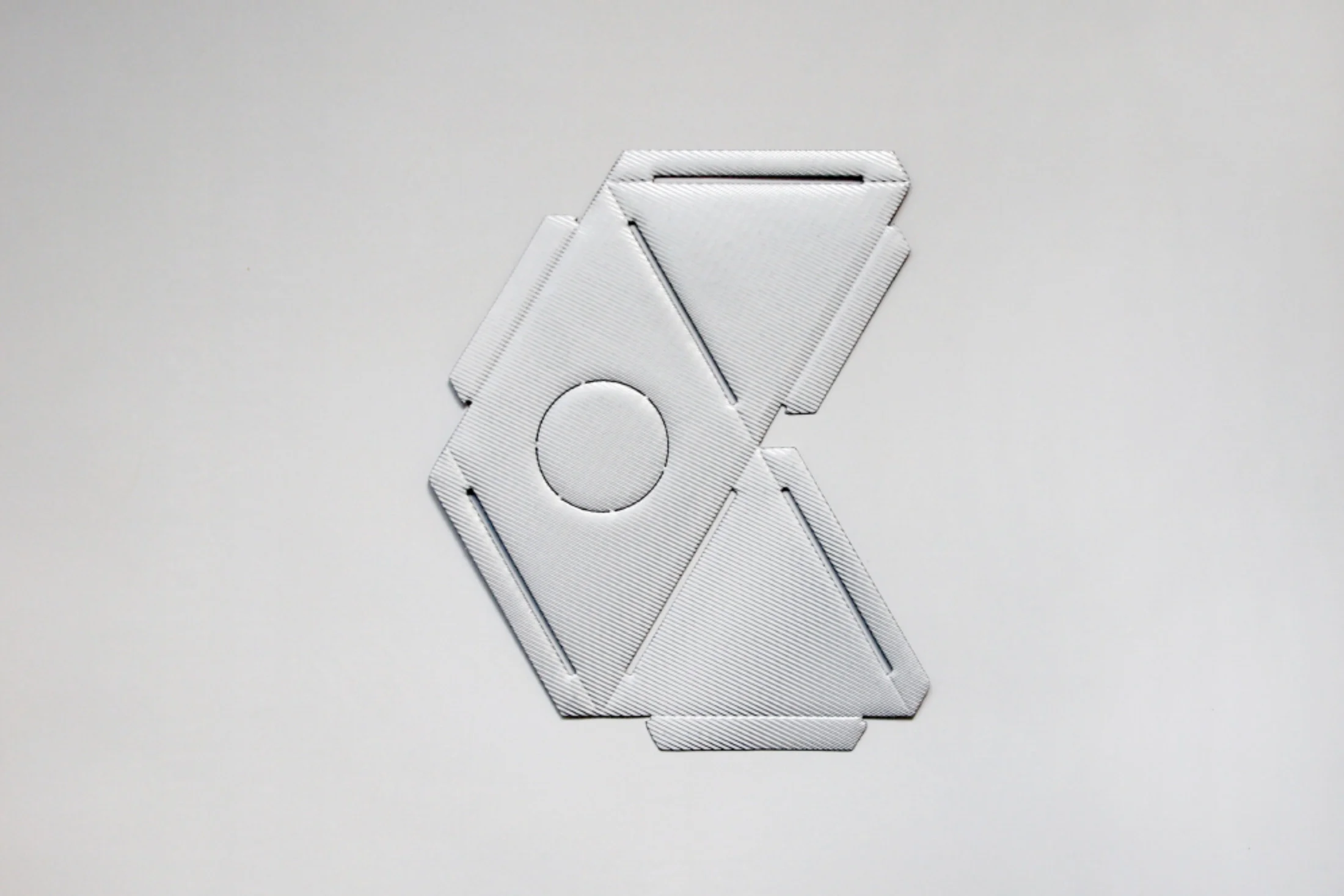
what:
font design
when:
2012–2014
Hex is a display font designed as a part of the visual identity of Nowy Teatr Kielce.
Hex is drawn on the hexagonal grid. It is painfully consistent, rigid and not always nice. It comes in three styles: Regular, Bold and Black.
Hex should be applied moderately.
what:
visual identity
who:
Institute of Music and Dance
Culture Centre in Lublin
when:
2014
Graphics designed for the Polish Dance Platform is a part of the system of visual communication prepared for the Institute of Music and Dance. Most of the Institute's projects follow the guidelines of the system.
what:
multipurpose cardboard modules
when:
2009
Icosahedron, a fruit bowl or a lamp… Lithium might become almost anything! The identical modules are made of thin corrugated cardboard covered with protective foil.
what:
exhibition graphics
who:
Art Museum in Łódź
when:
2009
The exhibition arrived in Łódź after being shown in KW Institute for Contemporary Art in Berlin. Klaus Biesenbach, who curated “Political / Minimal”, gathered quite a few contemporary masterpieces – minimal in form, yet politically bold. Among the artists – only the stars…
what:
a series of bags made of foam
when:
2008
Fi is made of one piece of polyethylene foam cut in such a way, that you can transform it into a three-dimensional object. With no stitches or buttons. Geometry as a slave of fashion…
Fi comes in grey, black, sometimes yellow.
what:
chair sweater
who:
Ujazdowski Castle Centre for Contemporary Art
Bęc Zmiana Foundation
when:
2005
S is a rectangle made of thin, soft foam. You can fold it, zip it and put it on an old, ugly chair. Or the one that’s too beautiful… What you get is a soft, warm and comfortable seat shaped like a strange mushroom.
S was designed as an element of the summer cinema scenography at the Ujazdowski Castle in Warsaw. Afterwards it had begun it’s triumphant journey through gardens and backyards of Europe…
what:
graphics and typography /
renovation of archival photographs
who:
Rój Publishing House
when:
2011
Perpetual Remembrance (Pamięć nieustająca) is a multi-faceted story of the last hundred years of Polish history. The focal point of all depicted events is a unique place – Marshall Piłsudski Square in Warsaw.
572 pages, 450 previously unpublished photographs.
what:
visual identity
who:
Goethe-Institut in Warsaw
Polish Institute in Berlin
Bęc Zmiana Foundation
when:
2010
The Promised City was a multidisciplinary artistic project spanning between Berlin, Warsaw and Mumbai. Artists from Germany, Poland and India sought answers to the question about the strangely magnetic force of the cities. The tools were diverse: from photography, through literature to theatre and architecture.
what:
graphics and typography of the book /
preparation of archival photographs
who:
Regional Museum in Stalowa Wola
when:
2013
Elżbieta Skromak had worked on the subject of pre-war Polish-Jewish relationships for a few years. The publication of the book and the exhibition – both called The Jew, My Neighbour – were the conclusion of the project.
what:
visual identity
who:
Ministry of Culture and National Heritage of the Republic of Poland
Institute of Music and Dance
when:
since 2015
Oskar Kolberg Award for special achievements in the realm of folk culture is given by the Minister of Culture each year. The recipients of the award come from diverse fields and backgrounds – they are folk artists, poets, promoters, researchers…
The graphics of the award is being designed by us each year in a consistent manner since 2015.
what:
installation
who:
Łódź Design Festival
when:
2008
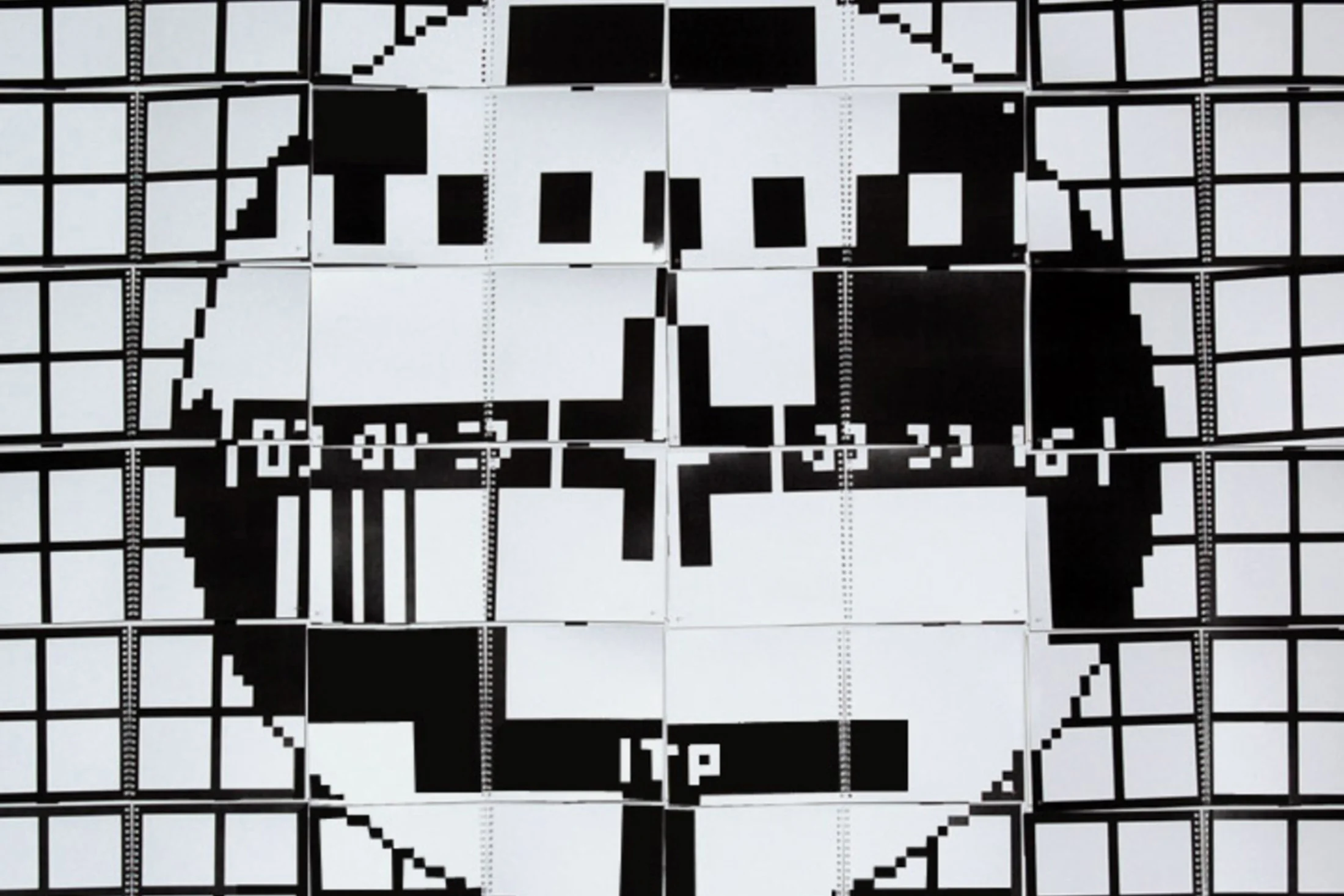
Completely un-electronic screen made of 24 booklets. It is attached to the wall and is broadcasting totally un-breaking news. It works unplugged and disconnected. And yet, it receives a few channels, which you can change and mix by flipping pages in the booklets.
what:
visual identity
who:
Regional Museum in Stalowa Wola /
Adam Mickiewicz Institute /
Polish Embassies and Institutes all over the world
when:
2009–2013
curators:
Agnieszka Jacobson-Cielecka
and Paweł Grobelny
Unpolished exhibition had been travelling around the world for over four years, showing the best works of young Polish designers. The exhibition visited Paris, Seoul, Düsseldorf, Budapest, Helsinki… and many other cities.
The visual identity of Unpolished was awarded in the Muzeum Widzialne competition in 2013.
what:
visual identity /
architecture of the mobile festival space
when:
2014, 2015
The complete set of designs for the first Polish whisky festival. We began with the logo and finished with the foldable, modular stands for the exhibitors.